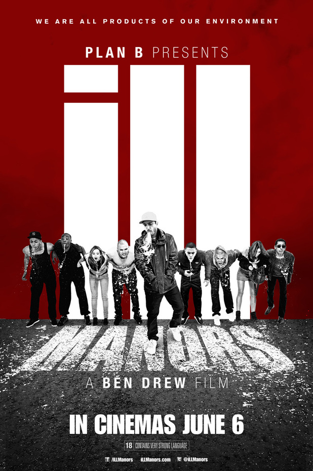
1)What are the key conventions that help you identify the print text (e.g. title, central image, review quotes etc.)?
The key conventions in this poster advert of ill manors is the central image which is large and shows one of the main protagonists along with a view of buildings and trees which are used to compose the title 'ill manors' as the 'ill' is perhaps shown as building and the 'manors' is shown on the road, which looks similar to a zebra crossing. All these things help you identify the print text which is a poster of the film.
2)What design features help identify the Ill Manors brand?
The colour scheme in this poster is yellow, black and has parts of grey shown and this has a contrast of bright and dull, which could identify positives and negatives in the film. The font of the title is in large block capitals which makes it bold and stand out from the poster, the two colours used for the title are white and yellow which are two bright colours and this makes them stand out from the rest of the poster. The overall design of the poster looks good.
3)What examples of synergy can you find with the broadcast platform or other print examples?
The poster looks as if it has been photographed in the suburban areas of London and Plan B decided to film in East London where he originally grew up to show the experiences he faced when growing up. Also, he wanted to create a low-budget film to help promote the grim reality the youth live up to in the suburban areas of London.
- What are the key conventions that help you identify the print text (e.g. title, central image, review quotes etc.)? The key conventions in this poster advert of ill manors is the central image which is of many of the main characters in a line leaning forward and shows one the main protagonist walking in the middle and he looks larger than the other characters,so he seems more superior than them.
- What design features help identify the Ill Manors brand? The colour scheme of this poster is red, white and black, and text is all white which makes it stand out from the rest of the blog. This has a contrast of bright and dull, which could identify positives and negatives in the film. The font of the title is in large block capitals which makes it bold and stand out from the poster.
- What examples of synergy can you find with the broadcast platform or other print examples?
- What are the key conventions that help you identify the print text (e.g. title, central image, review quotes etc.)? The key conventions to help identify that this is the DVD cover are the review quotes, which show how many stars the film deserves from different newspaper and one or two words they would use to describe the movie e.g 'utterly gripping'.
- What design features help identify the Ill Manors brand? The font design helps identify the Ill Manors brand. The main character at the front helps the audience to recognize the film. The gun at the front portrays violence besides crime which fits into Ill Manors brand and helps people to identify it. Also underneath the title "Ill Manors" it states that it is a "Ben Drew Film" indicating the Ill Manors brand. Another thing is the design of the image in the background of the estate buildings hurdling in gives the idea of the Ill Manors theme of estates being intimidating.
- What examples of synergy can you find with the broadcast platform or other print examples? There is synergy between other print platforms such as the DVD cover and the music packaging which show the same title in the way it it shown here.


No comments:
Post a Comment